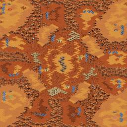


| Back to "beta" maps. Show all maps.
Last update for (4)quattuor sunt dura : 2014, 08, 10 07:08
| mapID | Mapname (comments) | map size | Author | Rating | Type | play type | | 4680 |  (4)quattuor sunt dura (4)quattuor sunt dura | 128*128 | Veezal | 2.1 | beta | ground |
The map has been rated 26 times and got a total of 55 points |
<<>>
You can rate the map here. Chose a grade between 10 (best) and 0 (worst).
| Veezal | | | I apologize ahead of time about this map. The decoration wasn't finished, but because of a storm that happened in my area the power was surging and the internet was fluctuating so I didn't want to make changes to the map and have the power go out and lose all of it. I just ended up saving it and posting here and then about 5 minutes after I did my internet went down so now I get to talk about the map.
The map is named, "Four Are Hard" in Latin, because four player maps are hard to make. :p I didn't realize until I really started trying to make one.
So what I wanted to do with this was to just make a generic map that was not anything overly special, however I didn't want to make shit. This is what I came up with, and I didn't realize how much it resembled the map, "Yellow" until after I made it.
Uhm, like I said the decoration is not done and just any input would be extremely appreciated to make this map better. I want to improve my map making skills. I find it sort of an art, but with a purpose. | | CardinalAllin | | | | I think this is Xelious. Either way, great map. Nice one | | Freakling | | | Oh dear... I just hope that you have never formally learned any Latin; or else you just made your Latin teacher very sad.
- Wrong participle position
- wrong, or probably complete lack of, declination (please be not a native English speaker and go all "decliwhat?!" on me now)
- not sure whether one can even use "quattuor" the way you did, but if one can, I assume that it would have to be declined correctly (Quattuori). I would use "quaternio", though.
- "difficilis" or "arduus" may be better terms than "durus", but as far as I can tell it should be okay.
So try either of:
(4)Quaterniones duri/difficiles/ardui (sunt) (I'd personally leave "sunt" out...)
About the actual mapping thingy:
- work on your base shapes. The mains initially being but squares in the corners, that you then can gradually shape into whatever you need to make good use of the map space, is generally a good idea. The mains in your maps so far all look really unnecessarily odd, as if they were the unfavourable leftovers after you put everything elase down, or as if you did not plan them out at all.
Same goes for other bases, your nats seem too huge, your thirds also take up more room than they probably should. Same with the clutter terrain around the mains, you really do not need as much of that. Especially on a map like this, where you put expansions into the middle, you should waste as little space as possible on the outskirts to make sure there is as much room for the centre as possible, so you can place all expansions at an appropriate distance from each other.
The idea of a "purposeful art" is a good one, though I resent the implied idea that art generally has no purpose... | | Veezal | | | Well I guess Google is a bad teacher, because I don't speak Latin, dang translation. So I can change the name to make it proper.
As for the the map yes the bases are a little weird, and I still feel that they are extremely huge, well not huge, but on the large side. Is there any guide on that sort of thing about base shape and size? Also I did put the main bases in the corners to make it easier to make the rest of the map, being my first four player map.
The mains being overly large and long, are due to me trying to make everything even and fair, but with my inexperience on four player maps I kind of had an extremely hard time trying to make everything just even, not even good.
I'll try to see what I can do on improving the map, but I have a hard time struggling on this.
| | Freakling | | | Easiest way to do it:
Make the mains a square, as I said, then gradually reshape it.
All the other expos one can get a good hang of by placing the resources and a CC first and then just designing the terrain around it.
The most important aspect to keep in mind is spacing: Anything that's less than 12 tiles away from a cliff (or any other walkable spot of terrain) can be tanked from there. So keep that in mind to avoid odd tank angles.
modified by Freakling | | Veezal | | | | Alright, I'll try to improve on this and in the next 1-2 days I'll see about coming out with a newer, better version. | | Veezal | | | | Also when it comes to mains, is there a specific shape i'm looking for? |
| Replays
Upload replay for this map |
Add your comment:
Because of heavy spam on the map comments, it is needed to be logged in to post. We are sorry that this has to be done because nothing else stops spam bots
|  |


 (4)quattuor sunt dura


