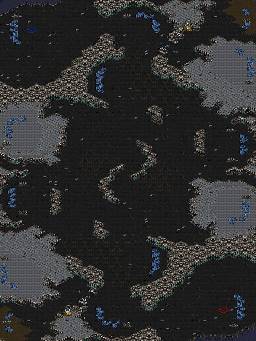
| Phobic | | |
This ones for x-species. I hope to give one to all the people who have been active lately but no promises.
This was largely inspired by Silverstorm and No Reason
modified by Phobic |
| Freakling | | |
| I don't want one, thanks. |
| Phobic | | |
you haz no choice.
I would also like to point out that the asphalt deco was a complete pain in the ass.
modified by Phobic |
| sTY_leZerg-eX | | |
| lol map is called X-Species by phonic |
| x-species | | |
| Ty good guy ;] ;d but i don't have time for maping sorry ;s |
| jungleterrain | | |
| Mine better be in Jungle terrain |
| Phobic | | |
| I've hit a creative roadblock for now but more in time. |
| LasTCursE | | |
i don't like the dirt dots deco.. make it asphalt or only dirt and it will look better i think.. :)
modified by LasTCursE |
| Phobic | | |
| I'm a little confused, can u gmcs it? |
| JungleTerrain | | |
| I think he means the spammed four tiles next to the xelnaga temples. |
| LasTCursE | | |
GMCS added
|
| Phobic | | |
| well balance wise what you guys think? I made the third easier to take with the minerals+lurker eggs instead of 2x toss temple |
| JungleTerrain | | |
I don't think the middle expos will be used, even though they are double gas.
And the Xelnaga temples just look annoying. All they do is make a tight middle even tighter.
Also, fix the gas issue. You might say it's part of the concept, but this is one of three maps you have uploaded that have this awkward/bad gas placement. I suggest you get rid of it, because you exhausted the concept already. It will NOT make the players more willing to take such a risky double gas expo in the middle.
In general, I recommend you standardize more of this map. For example, the third gas wouldn't be so complicated to take if you removed that second path behind the main and removed those neutral sprites.
Map is tight, but I think I said that already.
Get rid of the water at the corner of the mains so people can easily place supply depots/tech buildings/pylons there. That water is just annoying there as it is. When you get to the decoration step, I recommend you add some dirt/mud/grass terrain at the mains. It'll look prettier, since masses of asphalt looks pretty boring if overused.
I recommend you make the mains rounder, as well, but you don't have to. This is merely a suggestion for decoration, and if you apply the other edit concerning removing the water in the mains, it will help in making the mains smaller to keep them from being to big.
I also think the gas expos at 3 and 9 can be shrunk a bit to give the middle more space. Any space gained in the edits should be allocated to giving the middle more room for flanks, and possibly to add another outside path, if possible, like in (2)Destination.
Hope this helps and good luck!
modified by JungleTerrain |
| K_A | | |
| Zergs would love containing and expanding in the middle, except that terran is just going to drop their main because IT'S FREAKING GIGANTIC. |
| Phobic | | |
| Thanks I'll make an edit. |
| Phobic | | |
So i did a rework of the concept and I like where it is. I haven't done deco yet and theres a lot of technical things like ling tight walls and such that I'm not gonna do till I solidify the concept.
I'm looking for better structure ramps because these ones I do not like.
modified by Phobic |
| Kinosjourney | | |
| I like the layout, a bit cramped though. |
| JungleTerrain | | |
| I don't remember what it used to look like before. What did you update? |
| Phobic | | |
Original

Uploaded with ImageShack.us
modified by Phobic |


 (2)X-Species


