| Kinosjourney | | |
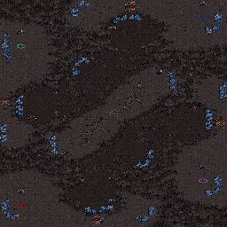
A quick map i made while i was bored today, it looks stale and ugly cause im horrible at Ashworld deco and with limited space at the naturals the mineral lines are stale aswell to conserve space.
Im considering removing the gas at the protected naturals as it would be too easy to secure 3-4 gasses. what do you think?
Also, disregard the starting location for player 12. It's not in the mapfile but i cba to fix the picture :p
modified by Kinosjourney |
| coV | | |
| wow man good job on this...your 2nd rotational sym? it looks pretty solid for 96x96. Yes you should remove gas at the safe natural...just get the deco going |
| ProTosS4EveR | | |
| too much ressources, other than, really good attempt to a 96*96 4p map |
| Kinosjourney | | |
Thanks, i'll remove the gas and add a tiny bit of deco :)
I edited the map, added minor decoration, removed gas from protected expoes and removed one mineral rock from each main.
modified by Kinosjourney |
| SiaBBo | | |
| Looks good. I personally don't like 96x96 maps because different gameplay and stuff, but this looks solid like coV said. I would like to see this in 128x128. |
| LasTCursE | | |
| kinda small for a 4 player map don't you think ? |
| Kinosjourney | | |
| I like small maps, this one is a bit cramped but the concept wouldn't work on 128x128 either. |
| sTY_leZerG-eX | | |
Nice man I like this, u nailed the rot Symmetry (except the min only's, blues and reds look + harassable)
On the down side THE MAP HAS WAY, WAY 2 MUCH MONEY FOR THIS SIZE.
I recommend taking off minerals, and maybe even a couple of expos (Remember this is not 128 128*)
I suggest:
# of mineral patches
- Mains 7
- Nats 6 or 5 or somewhere between
- High ground min only's 3
- Middle min onlys 5
- I would remove those middle high ground expos and + some cool unbuildable shapes |
| Kinosjourney | | |
Hard to fit some cool shapes in the middle and theres already way too much wasted space, removing mid expos will make the map a bit too stale. But i'll consider it, and i'll remove mineral patches later :)
Also, the reason those expos are harder to harass is because if i had the minerals next to the edge the other base can shell the minerals with tanks and theres no way around that either :P
modified by Kinosjourney |


 (4)Ashtray


