| RaDiX | | |
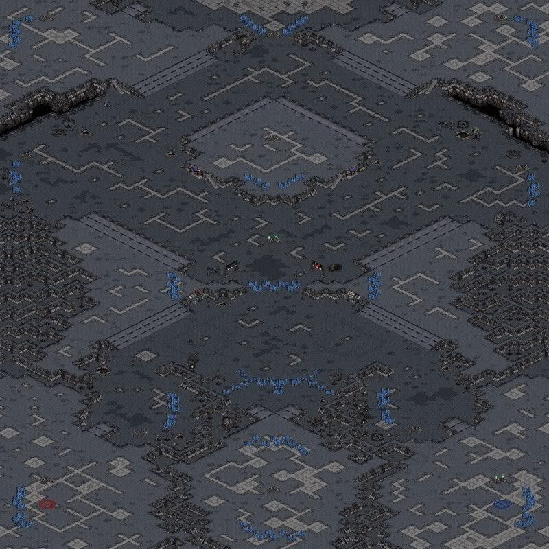
| This is map, where i tried to put all of my skills to 1 map, and i don't think i succeeded in it... I dont like this map much, but this is all i can do to it, tell me your thoughts... (Nightmarjoo, i would appriciate a pic... :) ) |
| Antares | | |
what do you do at uploading? :D
you should have recognized that every map needs an (n) or an (o) expression at the end of the filename. then the sys wouldnt cut your mapnames...
modified by Antares |
| RaDiX | | |
| has it cutted now? And does it really matter? Is that the main point? |
| Greg | | |
| it's not the main point, but it's a fairly large factor. how can you expect people to help you if you make it a pain in the ass to look at your map. just follow the instructions at the upload area, it's not that difficult. |
| Nightmarjoo | | |
hmm not bad, I suggest taking out the signs in front of the nats, the entrances should be more open; I think it would help to open that wall somewhat too besides killing the signs; I would be more comfortable with the nat being closer to the ramp but that's no big deal.
The middle expos are a bad idea imo; if anyone takes them they will destroy pathing from nat to nat. My suggestion is to take out the geyser, make the top expo face up and make the gas above the top one on the other side. That way the concept would remain, but pathing would be less hurt, and they could expo on the other side if they wanted the gas. You make t too strong this way imo, t could just push to the middle and get free gas and 2 mineral expos.
I like the concept behind the southern expo and the mineral wall there, however I don't see why it can't face up :)
Not only that but that's a huge amount of space for that one expo. Maybe make two expos using the concept you did above there, with 2 expos sharing the 1 gas, that would use the space better.
Could you either remove or even out the tank holes in E/W?
Could you make the very top symetrical? It's off and it hurts it imo. Also I suggest allowing a little more room between the northern most cliff and one below it, that would help movement and flanking a lot. I think the map will be fine as far as tightness is concerned if you allow more room.
I will add gmcs to better show my comments.
I like the map for the most part :) You're getting better. |
| Nightmarjoo | | |
| Yeah check gmcs I added some things there I didn't mention in my post above |
| RaDiX | | |
Nightmarjoo, if i take gas off from that 2nd natural, Z has so hard time b-cuz natural has no gas... Should i add the gas to natural and delete gas from 2nd natu?
Btw, i updated some things, so if the pic could be updated too.... ? :D .. And about the pic and why i can't upload it: Don't you think i have tried to upload pic for 1000 times? I have, it just doesn't accept my photo type, and im too lazy to dl some program wich makes the pics accebtable... I see much more easier to let nightmarjoo do the pix ;)
modified by RaDiX |
| Fry | | |
The idea itself is really not new,but compared to your previous works,I would say it's a step forward.No longer straight lines(good!)
Nevertheless the map have some issues.Firstly the mains are definitely to huge.This means they are heavy to defend vs drops and harass.With 10 min blocks(in your main) you encourage t in the early game.But more worse is a nat whitout gas.You should change this.
On the other hand the map itself is very anti-terran because of those huge chokes & large pathes.
Last but not least evry expo is very hard to defend(except the one between the mains),'cause the terrain is so open.The terrain deco is primitive,but not just noob maps have this problem.But what really hurts is the positions of some d-dads in the middle.
|
| RaDiX | | |
| Well, the doodads are fixed now... Pic just not updated yet... I did some other things too, dunno if they're good or bad... |
| Fry | | |
Don't get me wrong.The map itself needs more d-dads but learn to place them and not just drop them.
Learn to place in a better way a min line also.So that your workers can gather effective.They shouldn't have to go long ways.Also their cruising radius shouldn't affect the mobility of your units inside the base.Oh yeah and 10 pieces are not ussual...
I suggest you should delete the expo in the middle & make the terrain unbuildable & the middle itself tighter.
The expo between the main have a huge surface.Make her smaller. |
| RaDiX | | |
| That's all the deco i can do... :P |
| Listoric | | |
| picture? |
| RaDiX | | |
| Ye coming.. ^_- |
| RaDiX | | |
| Fixed some things: The 6 o'clock expo uses now that idea what i had in south-middle, and i deleted gas from south-middle... Also opened the map a bit from 12 o'clock... I also added gas to natural, and the 2nd naturals gas now has 2000gas. I tryed to put some doodads and do the deco better.. Now just waiting for the pic.. :) |
| NastyMarine | | |
| no pic ... its not working |
| RaDiX | | |
| Yeah.. I hope some1 could do the pic... (Nightmarjoo...) He's so nice ;) |
| Nightmarjoo | | |
Looks much better; new problems now.
Those mineral formations at the nats and mains are bad, especially those at the nat. Few people seem to understand what makes a formation good, if you want I can edit those.
The mains are too big, cut them down and move the nat closer in. I also suggest making the nats on the outside, not on the inside. If you keep them this way (which is fine if you do the following imo) put the main formations on the outside and make vertical formations. In fact, I like the latter idea better. The nats you can make a little larger with the mains being smaller; the nats are too small at the moment.
I still think the 2nd expo needs to lose its gas.
Decoration is much better now.
I like the map. |
| RaDiX | | |
| Well, im not really sure did i understand even half of that post (my fault, bad english), but i cut the mains smaller, and opened the natural a bit... I would be happy, if you'd make that thing to this map u posted earlier... Pm me for password... And thanks for all from creative post :) |
| RaDiX | | |
| Comments plz :) |
| Nightmarjoo | | |
| I'm working on an edit, I'll post a pic soon. I am an admin and I don't need your password to edit it :) But I won't edit it until I release the pic first. |
| RaDiX | | |
| So nightmarjoo are you going to edit this or not? No rush, im just curious :) |
| Nightmarjoo | | |
| lol woops sorry I forgot about it, lemme go finish that now^^ |
| RaDiX | | |
| Yeah, thx ^_^ |
| Nightmarjoo | | |

modified by Nightmarjoo |
| Nightmarjoo | | |
| Mains smaller, nats opened and repositioned, mineral formation of mains moved, gas at cliff expos removed, 1 mineral removed and geyser added to N expo (I did that because having it double sided meant nothing, now if you want to take minerals well you have to make building on top, but you could make building below for just gas and few minerals), minute decoration changes, and the map now opens in staredit :) (albeit it cuts off the tops of high doodads when you do open it in SE ><). |
| RaDiX | | |
| Thx for those updates :) Now i have to test-play it a little ;D |
| RaDiX | | |
| btw, when i open this map with SCM, I just see it as same as it was before the updates :O |
| spinesheath | | |
| And in SE? Does it look different in different editors? That's not impossible, actually :D |
| flothefreak | | |
| if you had just mirrored the whole map in the first place, you've had much more normal ramps (esp. in mains!!) and less work/less ugly ramps... |
| spinesheath | | |
| Indeed, with the uprising of inverteds, people seem to have stopped planning maps according to ramp usage... |
| Nightmarjoo | | |
| The map here is the same one that you made, I didn't upload my version. Would you like me to? I can upload it over your version, or I can upload it as a new map, what do you want? |
| RaDiX | | |
| Just update this i think... :) |
| Nightmarjoo | | |
| ok map, pic replaced, obs added. |
| Nightmarjoo | | |
| btw spines how do you make a map different in different editors :) |
| spinesheath | | |
Well, depends on the editors, actually. There are 3 sections in a mapfile that are important for the terrain: TILE, DD2 and MTXM. TILE is the terrain as it results from ISOM brushing, DD2 is the Doodads, and MTXM is the combination of those two.
Starforge loades a map from MTXM, as far as I am informed. SCMD2/SE load it from TILE and DD2. So if you put different stuff in those sections, you will see different stuff. SC uses MTXM, btw.
But I am not sure how far SCMD2 checks if MTXM is "correct". I think it does when checking for correct Doodad placing and such, but I really can't tell for sure. |
| Nightmarjoo | | |
| realized I had added fucked pic, has been replaced with the working one. |
| tktkvroom | | |
dang alot of expos really getting in the way
expo @ 12 straight up is like what? ramps barely get you in there plus no room to get across if a cc is there. expos on the high ground on the sides with the big wide ramps show be on the out side instead of inside. all them minerals in the middle from main to main make me sick =( & to many minerals on that island expo at 6. oh & mineral formations @ 12 expo are nasty
check gmcs |
| tktkvroom | | |
| ehhhhh more gmcs ^^y |
| Nightmarjoo | | |
| I don't agree with any of the things you pointed out. |
| RaDiX | | |
| I don't agree with those changes either.. :S... |
| tktkvroom | | |
| lol I know exactly y you dont agree with them joel ^^,,l,, but w/e |
| RaDiX | | |
Added 1* replay... Good TvP game, i lost..
*= there are 4 replays, but they are the same, plz some admin delete 3 of them cuz i dunno how :D (Or tell me how)
PS. 1st time uploading rep |
| spinesheath | | |
| Wow, I can do that as well :D |
| RaDiX | | |
| In that TvP I noticed how fun my map is.. The mineral wall in the middle makes it fun... B-cuz toss/terra may have all his units in the other side, and then... He attacks from other side, and it takes so long to get units there.. This map is the starting map in the KOTH of mJ... So i'll post more reps in future. |


 (2)Space in Hell
 -
- mJ.RaDiX vs
  mJ.HumPie(1on1, 1.14)


