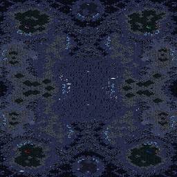
| Antares | | |
an experimental way of making a map without many gas
hmm what do you think? |
| panschk[FP] | | |
wow antares, you reached a new personal level of mapmaking in the past days;)
great job, I love it. |
| NastyMarine | | |
| looks great. i really like the layout |
| SynDrome | | |
Wow, this is uber fun map. lets try it out.
|
| Arden(WoF) | | |
| The layout is pretty sweet. Too bad pathfinding will be annoying =/. Units will follow a path directly through the mining of those middle expansions (on certain positions). |
| NastyMarine | | |
| yea i think it can be an easy fix with the right set of doodads placed near the min lines so it can direct units away from where command centers (etc) will be placed. |
| Antares | | |
oh i forgot about this
well i will fix it somehow.. |
| Antares | | |
i thought of removing totally the center expansions, this map's aim some anti-macro and let the players show their true skills, not help massing
|
| SynDrome | | |
| GMCS |
| Arden(WoF) | | |
| Then the middle expansions would be too close... |
| NastyMarine | | |
its layout, sadly, is macroish so i dont know how your gonna get away from that here :)
keep it as is.. it looks good.. just make sure pathfinding etc is okay. |
| Arden(WoF) | | |
| I would really hate to see those two mid expos go... I hope there is another sollution somewhere. |
| boongee | | |
I think the nats are a bit exposed
otherwise good gj |
| NastyMarine | | |
| I dont think the nats are exposed, but if u put a simple doodad by the edge, i think it would be okay. |
| SynDrome | | |
I suggest adding at least 1000 gas to the nats, at least to give toss some help against Z and to give them time to expand to the second nat.
This also alters a bit pvt but P will still own T. |
| NastyMarine | | |
i dont think this expo layout will disfavor or favor match ups so i dont think adding gas at the nats are necessary imo.
i think it shuld stay as is. |
| Antares | | |
| edited |
| VomiT | | |
| looks very nice, i love the middle expos |
| Antares | | |
| maybe i should change type to experimental, but lets leave the recently ^^ |
| LGI | | |
Really nice, i see that your map making skill level is up!
The path finding is good everywhere, the map is original, it's god some new staff. I really like it, but there is some things that bothers me.
First the size of the main bases. They could be larger don't you think?
Second the main minerals placement. I think it will be best to move them more close to the map edge on the other side of the main base, because this is a 4 players map and that means that in 2v2 game mode if one of the players is terran the other guy could help him to camp behind the main minerals line and it would hurt a lot while trying to push back. Not to mention the fact that you will be on high ground.
Third i am not sure if you have test the doodads wall in the center where you use for a wall near the expands to make good path finding. As i am looking at the picture i think that zerglings can pass trough some little holes, but i am not sure. Be sure you have test this.
So nice job. It could be better whit the Top vs Bottom path finding. It's a little boring to go on this straigh line, but this doesn't hurt so much. |
| lnept | | |
| TvZ another map where Z is fucked? |
| Frank-Terrorist | | |
Cliffable main is always scary for ZvT, plus the open nat with no gas will make it harder to get a lot of muta to stop it. I think T will rape Z on this.
I also found TONS of bad spots around the islands where tanks can be dropped for free shots at workers. These all need to be fixed.
Left of the red and purple mains, I found a total of 4 spots where tanks can be dropped for free shots at the gas. There are a couple spots right of the teal base as well. Blue base looks fine. |
| Listoric | | |
| I like it, looks very interesting and micro intense, but the name is sorta stupid, Mhor Gyar - sounds like "more gay" to me ^^ |
| 5pool | | |
| lol listoric x_x |
| Antares | | |
damn you are hell right frank with those spots, i always suck at this 'cheesy area' issue :(
and about the name: mhor-gyar is an RPG world that i and my friends created long ago and the sky was purple |


 (4)Mhor-Gyar


