| coV | | |
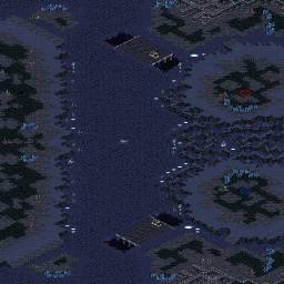
| My new map...it was kind of inspired by Paranoid Android. |
| sWaGu | | |
| very different from paranoid android though |
| coV | | |
Eh yeah, but the idea is kind of similar with the big resources you have to fight for and that blue and red's main are kind of next to each other.
Tell me what you guys think...
modified by coV |
| boongee | | |
It's pretty linear. Games here will be too straightforward as it is now, but if you can come up with something creative and innovative for the left side of the map it will be much more interesting.
modified by boongee |
| sTY_leZerG-eX | | |
The map doesn't look bad, but the expos are all positioned horribly IMO.
I suggest u take a look at maps here that have essentially a similar lay out and get inspiration.
Also If you split the map in half in any mach up that has a terran, and the game gos into late, late game T>p T>z P>z , you need more expos that are not clearly in one players side.
I would also add an island in the middle.
Then if all gos good get deco going. |
| coV | | |
How shall I set up my expansions?
And give me ideas on the left side...unbuildable?
And I think it would cause pathing issue if I make a island in the middle clearly cause it is 96x96
modified by coV |
| Neon | | |
Generators are bit odd, since they create different width to bridges.
I doubt island in middle works on that size without breaking left side partially.
Looks fine so far :) |


 (2)Twilight Star


