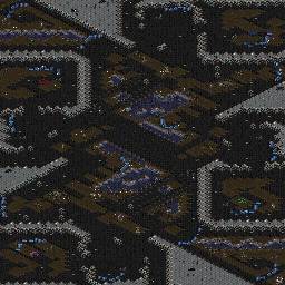
You can rate the map here. Chose a grade between 10 (best) and 0 (worst).
| NastyMarine | | | | great detail and fun layout but very sloppy. | | 1iCH | | | Tell me how ive been sloppy and ill try to rectify it. Much appreciated.
If you are referring to the fact that in some parts there is symmetry with terrain and doodads and in other parts there isnt, that is planned, i wanted to make this map feel natural as a map, and not be one quarter of a map pasted into four corners. I tried to give it asymmetry.
modified by 1iCH | | 1iCH | | | | The pixellation doesnt help by muddying up the centre bridges and making them look 100% copy and pasted. | | Nightmarjoo | | | Asymetry does not form a more natural feel, asymetry forms positional imbalances. Proper decoration forms a natural feel.
Vulnerable main line.
Very sloppy/poor expo layout, they're just not intelligently placed at all.
Awkward/small mains.
Map is tight and awkward, pathing is poor from small bridges, no flank room anywhere really.
Retarded nats too.
Sorry for harsh language/comments, but I don't really see anything I like about the map. I can't point out really anything to change, maybe just redo the map with a mindset to make it not awkward to play on; symmetry to an extent is necessary for best balance, decoration can make a more natural feel. When you're ingame unless the symmetry was poorly executed you won't notice the symmetry. When constructing the mains/nats/other expos, keep in mind the building space, ability to defend as well as potential to be attacked, consider their worth, how likely they will be attacked or taken. For the pathing of the map, you usually want to avoid having it go through tight bridges. Also, try and get a better degree of positional balance; consider sizes, distances, pathing, obstacles/lack of. Your middle is set up for f(-x) = -f(x) symmetry, but the outside of the map is set up for counter clockwise symmetry, then you have NW/SE set up for f(-x) = -f(x) symmetry, you need to pick one :) I think this contributes to most of the awkwardness and is probably what Nasty saw/meant in calling it sloppy. For an example of poor execution/positional imbalance, purple's mineral only is completely different than teal's mineral only, which is very tight and in front of another expo. Red2Purple pathing takes a fairly open path, Purple2Teal pathing takes tight bridges. Red2Teal pathing takes an open bridge. Purple2Blue pathing is very long and is even paths and is awkward. There are other issues, but I think they are more evident/recognizable from my earlier complaints. I reccomend starting the map over from scratch, the concept doesn't seem very good to me, doesn't look like it's possible to be executed well =/
Sorry for harsh comments :( | | 1iCH | | | | Thanks alot for the time nightmarjoo, thats an awful lot XD. Since this is only my second map im still in the dark about how make maps effectively i suppose. I guess practice makes perfect. I'll put this down to experience and start over, and use your guidelines, and try and work intelligently :P. Thanks again. | | Nightmarjoo | | | lol no problem. Also, I know I said a lot, and that's all stuff you'll know eventually, this being your second map is pretty good :) My first five maps were all garbage compared to this.
btw and practice makes not as bad, not perfect^^ |
| Replays
Upload replay for this map |


 (4)Guile


