| aeoliant | | |
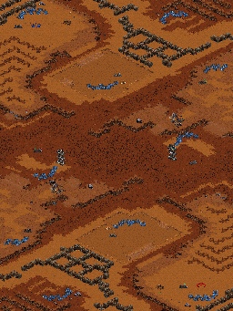
Hey guys, i wanted to make a map with lots of choices so voila. started with the halo map and changed it a little. not sure about race balances, etc because this is my first map but i know the pathing is messed up until you kill the temple. any suggestions to fix it?
modified by aeoliant |
| coV | | |
Well to me it's a good map for starters.
Picture needs to be bigger, by doing so save your picture from SCMDraft2 and open up a picture resizer and resize it to somewhere around 800x600.
Okay on your map, it looks very linish, make the cliffs more wild so it'll look better.
That backdoor entrance should be replaced with both neutral buildings and minerals because they can use two workers and just pass through and therefore can cause a proxy moment.
If you want to save trouble with pathing, then make red's natural down instead of up and make the gas on the side, same goes with blue. Then you can place another ramp there and see if it works.
Middle is buildable, you don't want them to proxy middle and keep building, so make some unbuildable spots just so only they can make turrets or 2x2 buidlings.
And the second gas is too secure. It'll be very easy to get more money like that.
Gas Issue: Red has got gas issue (gas issue is where the main's gas should be on the top or left 'cause it gives more gas.) So change that there.
The high dirt to ground dirt looks very small IMO.
The middle expansion makes it look tight so remove the cliffs and put them more to the edge so they can be more open and attackable and to make the high dirt to low dirt more bigger.
You'll get used to hearing this but they are only here to help you and you'll get used to the changes and see more balancing in your map making as you go.
Welcome! :)
modified by coV |
| Trooper | | |
| need picture? |
| Trooper | | |
3 main things:
Looks real square
Bad expo layout specialy for fe
too tight |
| freakling | | |
No natural means it is almost impossible to play as Zerg. Even 3 Hatch builds do not work here because ther is no real choke to defend.
It is too linear and tight, especially with the ramps on the side paths being standard size and blocked by minerals - terran can just push through the middle and secure half the map. If that is not totally imballanced it is at the very least boring game play.
And your deco looks just bad. Avoid straight lines. If you have no idea how to do deco then start by just placing different terrain types in a rather random way. That might give you an idea or at least something that looks better and more natural.
modified by Freakling |
| aeoliant | | |
| hey guys thanks for all the help. i tried to take all of your advice and this is what i got. deco aside, is it better now? more traditional main-nat layout with a highground choke. the min only in the corners are island (you cant walk through those breaks) and the 2 and 8 oclock highground expos have 1000 gas each. pathing is better now too. deco is to come once i look at other desert maps. |
| coV | | |
Eh tank holes?
Map looks better but make the middle more bigger.
And maybe put a neutral building over the minerals?
For balances T will probably dominate because tanks can just kill your natural if you stuck there :P
Seems like wasted space around 12 and 6. Put random cliffs there so tanks won't go and hit your buildings.
|
| aeoliant | | |
| where should i place a neutral building? and how could the tanks hit it? wouldnt they need vision? and if they had permanent (like not a comsat scan) vision arent you already screwed? but yeah i was planning on putting some doodads there to make it unwalkable. and i guess the holes in the compound should also be made unwalkable. i think to fix the "tanks sitting in the middle" part maybe ill add another ramp to the high gas expo behind the minerals |
| coV | | |
Hmm then why don't you move your expo on the side to make it more air harassable and less ground harassable.
You put the neutral building on the other entrance in the main. Don't remove the minerals, make your opponent work for it :P
modified by coV |


 (2)Blood Gulch


