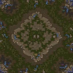
| JungleTerrain | | |
Comments please
Amontillado is a type of fine wine
modified by JungleTerrain |
| NastyMarine | | |
You stole my map idea. FUck you :D
nice layout construction and just ample passage space. good work here imo |
| JungleTerrain | | |
| im sure you can create something much more creative than this nasty |
| Testbug | | |
shit!
that is exactly how the new Aztec looks like!!!
you stole MYYY map idea :P
yes, yes nice layout this is a really good one!
why are there some power generators? what are they for?
modified by Testbug |
| JungleTerrain | | |
i dont know...
Why did i put them? i dont remember, was awhile ago when i made this... |
| Capn Awesom | | |
| I dont see the point of the neutral buildings, but the map looks like it would be fun to play |
| JungleTerrain | | |
| I havent tested this map since ive made it, so i dont know how it would feel to play this |
| Testbug | | |
| well, red and teal nats are safer than the others |
| JungleTerrain | | |
OoOoOo
How can i fix that? |
| NastyMarine | | |
| well I wasnt going to do this map. But it had teh same type of expo flow |
| JungleTerrain | | |
| i understand |
| MorroW | | |
teal nat 3 hex behind
move blues start pos 1 hex up
rotate reds and teals mineral formations with gas on the top
put rocky ground by the bridges and between third gas with nat, inspire of Beast, prevent imba mid game pushing
fix ove spots by the nats
remove neutral buildings
ok thats all for now, gj |
| Nightmarjoo | | |
I'll look into this more when I have time, seems neat from the small pic ._.
pm me a few times a week to remind me to comment it until I get around to it lol. |
| Testbug | | |
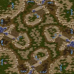
map id: 2167

map id: 3307
Wind%20Breaker.jpg)
modified by Testbug |
| JungleTerrain | | |
Update #1
-Switched Teal's and Red's mineral formations from horizontal to vertical.
-Tried to fix ovie Spots, let me know if they seem all right, but i will test them.
-Added rocks in front of bridges.
-Fixed Teal's nat.
-Also moved some nats' gases around to make them less vulnerable to attack from outside the main, and added a wall between bridge and nat at Blue's & Purple's Nats.
-Removed Power generators.
FEEDBACK PLEASE |
| JungleTerrain | | |
umg the pic 404 broken website gg ship
dont know what i did wrong with pic, so just open in your Editor, Scmdraft2, Staredit, Starforge(lol) w/e
modified by JungleTerrain |
| testbug | | |
| pic fixed |
| JungleTerrain | | |
| thanks testbug |
| JungleTerrain | | |
Update #2:
-Fixed Ovie Spots
-Finished decoration
-Fixed some terrain bugs
-Added Obs version
modified by JungleTerrain |
| LoA)RushStyx | | |
| somethings i aint going to say but good map |
| JungleTerrain | | |
| Please say, i'd like to hear |
| LoA)RushStyx | | |
| i finaly thought i made a good enough map with not a lot of enteries to get some votes if not MoM but man you just took it away really good map. |
| testbug | | |
| top and bottom minomnlies (near red and real) should be moved a little, i the mineral fields are too much in the edge. |
| SiaBBo | | |
| Why it looks like yellow? |
| JungleTerrain | | |
Map was made before Yellow. Its just been sitting here in the Map database for awhile. This is MapID 3345, Yellow is MapID 3384.
Should i edit minerals in minonlies, as Testbug pointed out?
Can I even apply map to MoM? This was made somewhere in November 2008.
modified by JungleTerrain |
| JungleTerrain | | |
Update #3:
-Moved mineral patches in minonlys near Red and Teal inward.
-Removed a little of High Ruins terrain on minonly's near Red and Teal.
Again- Is it possible to submit this map to this month's MoM competition, even though it was originally made in late 2008? |
| Nightmarjoo | | |
| Yeah go for it |
| JungleTerrain | | |
| Thanks Nmjoo :P |
| JungleTerrain | | |
Update #4:
-Blue's and Purple's natural chokes made slightly wider, were a tad too small before. |
| Crimson)S(hadow | | |
tael's base looks a bit tight to build in
maybe make tael's min line horizontal instead of vertical |
| JungleTerrain | | |
| Trust me, there is enough space. |
| Nightmarjoo | | |
Hey can you work on this map, improving execution and stuff before I post MOTM 1 and 2 together?
Your mineral formations kind of suck, especially in the mains.
I really doubt those ovy spots work, seeing as how the Python nat cliff ovy spots only work temporarily, and are much larger than these.
Red and teal's mains are weird and positionally different in a lot of little ways than purple and blue, such as mineral formation position, relative to stuff in the main.
The nats seem different too for the different corners. Seems like a lot of positional imbalances from imperfect use of rotational symmetry. These things aren't a big deal alone, but they add up and make the map look sloppy imo.
The 3/9 central big ramp things are so weird, why aren't they normal ramps? They're so different from the 12/6 ones I don't get it.
Overall the map is ok, but I think you could fix a lot of little things if you put time/effort into it, and I think you'd be more proud of it as it'll be your first MOTM. Just because you aren't Testbug doesn't mean your map has to look like Testbug didn't make it lol.
Just please, take some time to go over the map and fix all the tiny little things, fixing positional imbalances, improving decoration slightly, testing small stuff like wall-ins and whatnot, ensuring that the nats are comfortable for FEing and whatnot, to make the map as close as you can make it to being perfect. |
| Nightmarjoo | | |
| edited picture to make it brighter ._. |
| trcc | | |
If you could not see this picture, then i wonder how you see ashworld maps because this map was clear to me O.o
Add more brightness to your monitor? :O -_o |
| ProTosS4EveR | | |
is mine better?
http://i86.servimg.com/u/f86/12/46/27/00/amonti10.jpg
remove it if you take it or not
modified by Nightmarjoo |
| Nightmarjoo | | |
| I could it see it fine, but it wasn't pretty lol |
| Nightmarjoo | | |
I found it pretty hard to effectively place buildings for pvz FE (as p), the nat is just really wide. If you either add a neutral like in Othello, or shrink the choke a few tiles it should be ok though.
Top right and bottom left mains are "ok" in that they're useable, but still feel awkward. They're about as awkward as they look in the picture, they're just oddly shaped with a weird sl and ramp placement.
I didn't get to use the other mains, so they might be awkward too, or they might be fine, I dunno ._.
Robert said the ovy spots were fine, so I'll take his word for it. |


 (4)Amontillado
 -
- Kah.002 vs
  lukewarm(1on1, 1.16)
 -
- Kah.002 vs
  Lukewarm(1on1, 1.16)
 -
- Kah.002 vs
  lukewarm(1on1, 1.16)


Wind%20Breaker.jpg)


