| Lancet | | |
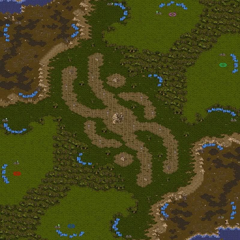
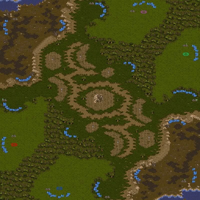
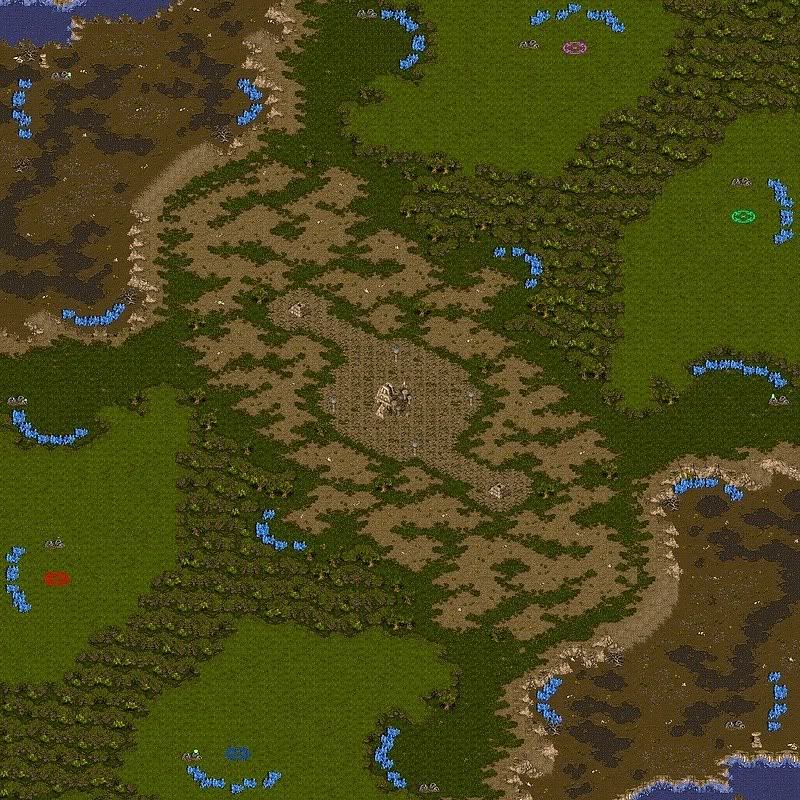
This is my map for the King of the Hill competition. The base arrangement is like that in Gaia with 3 possible types of matchups that can result in several different types of gameplay depending on the proximity of the bases by land and air. There is some novelty in that the mains are in "raised jungle" connected by a ramp to a "high jungle" nat with two narrow chokes; one exit/choke leading to the vast "high jungle" central valley and another leading to the lower "dirt" corridor between the southern and northern bases. The corridor is connected to the center by a wide ramp so a tank push down the corridor in the upper and lower diagonal matchups can be defended against.
What does terran get here? Terran can wall-in at all mains using a barrack and supply depot (it will stop everything except lings, ghosts and m&m from getting in), the nats are easily defensible as tanks on the high ground can lay waste anything coming in from the center or from the dirt corridor. There is a minonly next to the nat that can also be defended from high ground. and the center has areas between the ruins where turrets can be built.
Balancing this for toss and zerg this is plenty of room to flank in the center and the dirt corridors can also be used to attack from behind units attacking you from the center. The space between the mains can also be used effectively by air units like mutas and carriers.
|
| Crimson)S(hadow | | |
| flashy |
| Sworn. | | |
| map looks nice! |
| Crackling | | |
| carkling lieks. |
| flothefreak | | |
| only the jpeg does. every spawning setup on this map has some flaws...however, this one shows lancet on a new level. |
| MorroW | | |
| this is really cool, unique. good job! |
| Testbug | | |
wow! nice mineral formations!
specially the nat's formations.
mineral will be mined A LOT faster |
| Starparty | | |
needs visual improvement of the center imo, i think those squares might eve be irritating to look at in game. You kinda loose idea of where your troops are if it looks all the same. Consider making nice transitions from high jungle to high dirt and it will look real nice. + a terran player can actually set his foot there.
besides, the center expansions does need a bit more building space. |
| NastyMarine | | |
| wow well done |
| boongee | | |
| Yeah, add some stuff to the center. |
| Testbug | | |
okay, i downloaded the map.
nothern wide ramp has some unwalkable sports, and southern wide ramp is totally wrong. please fix |
| LGI | | |
Most of the mineral lines are... Let's just say not-well-placed-blocks, check out a SP map. I actually copy him >:] .
Maybe you can add some dirt in the center, somewhere... It will look more natural, and also there will be more spots for proxy build :) . Just make sure the spots where you pick for dirt, won't help terran too much in turtling...
Also the mineral expos in center might be just a little bit more open.
The corner gas expos, you can delete the water, and make them on high ground with wide ramps from both sides. And hope they look more like "C form" not like "L form" (mirrored "L") it's ugly :) .
Btw, what do you guys think in adding gas in center? I think it's ok since the expand is in center, and there is not much gas on this map either...
P.S. Can you make wide ramps from those you've used for your main? If you can, i have an idea for your center.
modified by LGI |
| MorroW | | |
up left choke to corner is much closer purple than red. i agree with these ppl, need different terrains in middle (or just some doodads) to know where u r. it sounds crazy but it true:D
anyway this is the best map ive seen here in a long time, tho Shine beats this ^^ |
| Lancet | | |
| Thanks for all your comments, I will read them carefully and check the things some of you have pointed out. |
| Rye | | |
| The only real problem that I have worth mentioning is the northwest ramp down. It's way too close to Purple. He can just park a few tanks at the mouth of the choke to his natural and Red's gonna take some siege fire if he tries to go down. |
| Lancet | | |
OK, let me address some of the comments.
The Center
I had a lot of problems in coming up with a terrain design for the center that would look good and harmonize with the map theme. I know you want me to change it and I am working on it but I am having trouble coming up with a layout that is both aesthetically pleasing and playable. I also don't want to make the center totally buildable for terran. Please give me a little more time as I am also quite "spent" now.
Large Ramps
Tesbug thanks, I removed the unwalkable terrain from the ramps. I had some difficulty with them as they are supposed to have a "curve" but I have not been able to do this very well.
The dirt expos
I wanted to place these expos on low ground as many of the maps with this base layout have them on high ground plus its part of the progression of this map high raised jungle > high jungle > dirt.
Now the following is hard to explain. With regards to the position of these expos, I had to place these bases off the central NW to SE diagonal (from corner to corner of the map) because the map has a rotational counter-clockwise distortion. Part of this may be the way I made it and part of it may also be that Starcraft maps have an inbuilt North-South distortion (that is not present in the East-West direction) to create relief (i.e. you don't look at the map from the top but from an angle). In any case a cc/hatchery/nexus there is roughly equidistant from the nat's high jungle-to-dirt ramps. More importantly, I timed the time it takes for say speed zeals to get from these ramps to a cc/hatchery/nexus in the dirt expos and it ranged from 10.41 to 11.02 seconds, very similar so the expos are equidistant.
The above is also the reason why I placed the water there. I realized that because of what I did above, blue and purple will have more space on their half of their "dirt" level than red and green. Let me explain, place a starting location marker on the dirt expos and draw a line across the map that connects both. Believe or not the way the map is now, with the water, this line will divide the dirt level into two parts of roughly equal area (I tried it printing the map, cutting out the dirt areas and comparing them by overlaying them one on top of the other). If I remove the water blue and purple will have more dirt space on their "half".
Gas, minolies and mineral lines
The map has 10 gas, I think that should be enough.
The central minonlies were a problem. If you move them one square closer to the bases they begin to be tankable from the bases. I would put more room to build there but I don't think there is any point in doing that as I didn't want them to "stick out" into the path of units going up and down the valley. There is a lot of space at the dirt level and elsewhere for proxy building.
Regarding the mineral formations, I got some conflicting advice from Testbug (wow! nice mineral formations! specially the nat's formations. mineral will be mined A LOT faster) and from LGI (Most of the mineral lines are... Let's just say not-well-placed-blocks, check out a SP map. I actually copy him) and I am a bit confused, can you elaborate a bit here? Thanks
|
| MorroW | | |
| the big ramp outside purple should/must be moved down. those small ramps at the sides wont help a protoss late game vs terran, he need the big ramp. same with terran. so please just move it down alittle... |
| Lancet | | |
| Well, it's like this. I could not come up with a viable idea for the center that I liked over the current one. I tried some high dirt terrain there but the tileset looks terrible. I tried several mixtures of high ruins and high jungle in different shapes but I still like this one better both for looks and gameplay. I did follow someone's advice and added some doodads there though. I also fixed some rough corners in the map, extended the jungle terrain, fixed some problems with the minerals and made sure starting locations were equidistant from the ramps. |
| starparty | | |
| lancet, do the map justice and think a bit more about it. You got the skill to do a way better center than that tbh. |
| Lancet | | |
Well, you may not like it but it's not really a bad center. It blends in very well with the other two areas of contrast ("high raised junle" and "dirt") and I really like it. So far everything else I have tried has been inferior and I really spent a lot of time to come up with it.
Also please bear in mind that: 1) I intended a substantial amount of it to be unbuildable terrain and 2) placing more or bigger structures such as in the map "Deliverance" or that central structure in your map "Space Lotus" would make it tight. I tried the "high dirt" tileset but it looks abismal against the "high jungle" background and very similar to "high ruins" in color. If I could use the "dirt" tileset on "high jungle" it would be great.
Having said that I will give it another try.
|
| starparty | | |
| what about trying to make a few ravines in the middle or something? might be a cool addition strategy-wise |
| Lancet | | |
How about these?


modified by Lancet
modified by Lancet |
| neobowman | | |
| I think the middle one is best. If not that, then the third. The first design just looks wierd. |
| Ag-Toss | | |
| I think the third one looks good |
| Starparty | | |
| yea the thrd is nice. personally id just modify it to look a bit more random around the edges, but besides that it looks sweet |
| MorroW | | |
the third one rocks.
how do u make pictures? |
| Crackling | | |
i like the last 2 :)
need moar trees on the jungle ;)
take a look at carkling pic :D

modified by Crackling |
| Lancet | | |
| OK, made the center edit. |
| Testbug | | |
i like the 2nd, the center is too buildable, maybe you can use the 3rd desing but with ruins?
red main looks some tight for me.
and wow!!! your new mineral formations are awesome!
in the current form, the center ruins are too linear.
the only think i dislike in this map are the mineral formations.
i have some suggestions for the nostalgia backdoors. i'll send you a pm |
| Rye | | |
On a more aesthetic note, the southeastern ramp is a beauty. It molds right into the cliff face. Purdy.
The northwestern ramp sticks out like a sore thumb, but you did say that;
"With regards to the position of these expos, I had to place these bases off the central NW to SE diagonal (from corner to corner of the map) because the map has a rotational counter-clockwise distortion. Part of this may be the way I made it and part of it may also be that Starcraft maps have an inbuilt North-South distortion (that is not present in the East-West direction) to create relief (i.e. you don't look at the map from the top but from an angle)."
So I suppose it can't be helped. I dig this map as a 2v2 or a 1v1, but I would avoid it as a FFA. Great work! :) |
| Lancet | | |
| Thanks Rye, one issue is that the reverse ramps stick out more than the regular ramps, it probably can be fixed but I am not sure I have the skills or the patience to make it more "natural" plus this map is by and large "old news" already. |
| MorroW | | |
| wow this middle really improved! |
| tktkvroom | | |
only thing i done like is that if you can hold your min only then the gas expo right by it is practicaly free since they are like 3 carriers width away from each other.
& the fact that purple & blue's min onlies are closer to it
also the midle gas expos just look way to fucking ez to hold seeing as how there is no room behind the minerals for tanks/lurks/hts/ne thing & there is nothign but open buildable land around it
i know im bringing this up a bit late since it already won the comp but i have been gone for awhile & just thought id share a bit of thought
modified by tktkvroom |
| Lancet | | |
| Well, welcome back! Those minonlies are indeed closer but I don't see how that will give you an edge in taking over the gas expo. Those gas expos are the same distance away from the ramps leading to the low ground. The middle expos are minonlies not gas expos. |
| riho | | |
| Your commentAwesome Map ! Is there an Obs version in the works? |
| Lancet | | |
| Thanks riho, you know, I never post observer versions of my maps but I will try to learn for this one and do it. Give me a few days. |


 (4)Shrine of Kelehmar

