| EffectHypnotize | | |
| lol, if this is bad tell cuz it took me roughly 45 minutes. |
| MuShu | | |
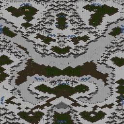
I think the top protion of the map looks more finished than the bottom. Many straight lines on southern part of the map. The mineral wall kinda reminds me of King of the Abyss. I don't really like how there is a long ocrridor to walk through, tankable, before reaching the center which looks very bare. And the big mains might make large drops very strong.
Then again, I am just babbling and you don't have to listen to me. :P |
| EffectHypnotize | | |
lol, yeah i intend to expand and decorate/refinish this map. like i said i just threw it together for the ice theme competition. the bottom was obviously done in a hurry but im gonna fix that right now.
and, shit it does look alot like kings of the abyss, ill try and fix that. |
| Falcon_A | | |
bottom expo seems sorta open to attack.
All things considered it aint bad (especially for 45 minutes) |
| Syrreph | | |
| Way to many straight lines, Path's to basese is really far and the expansion between teh bases is kinda cool, but it screws up pathfinding. |
| EffectHypnotize | | |
| i edited it guys, its way better now i think. |
| epidiOn | | |
http://www.panschk.de/mappage/newsscript/viewarticle.php?newsid=6
EH man, besides the lack of decoration, it looks REALLY good. I like the original ideas, but it isn't overdone, and it looks playable.
Personally, I'm VERY impressed. |
| Starparty | | |
| Your commentbottom ramps are horrible |
| LGI | | |
| The top part of the map seems good, but the other half... I would delete it. Anyway you still need work on the top part of the map. They are still some issues to fix like those holes everywhere, where you can drop tanks. Also the pathfinding will be very bad with those two blocking natural buildings on the way. |
| panschk[FP] | | |
| To me it looks like there could be pathing problems with the 12 expo. |
| EffectHypnotize | | |
| i still need to fix the pathfinding. il take out those neutral buildings too. |
| boongee | | |
| pathing pathing pathing |
| Starparty | | |
crap tileramp, crap tileramp, crap tileramp..
just remove it |
| EffectHypnotize | | |
| lol, yeah ima noob at those, some one can help? i like it tho. |
| EffectHypnotize | | |
| o yeah epidion, thanks |
| --v mOsQ | | |
| +1 noob map :P |
| EffectHypnotize | | |
| v mosq. one more noob map? lol its not that bad is it? and try to help me or dont say anything at all. |
| Sky | | |
| nice map, you makes maps faster than i can, i take a week just to make 1 map. ;( |
| EffectHypnotize | | |
| lol sky, well urs are a bit better most of the time |
| epidiOn | | |
| EH man, don't listen to anything mOsQ says, seriously. It's just easier that way. |
| EffectHypnotize | | |
| is he hated and just a critic? |
| yenku | | |
I dont hate him.
SP, dont be critical, not expected from you.
I like it, especially for the given time, work on the chokes to the nat, take out all that superfluous terrain that makes it smaller. And find a way to better place the ramps to the bottom. |
| EffectHypnotize | | |
| k thx |
| Starparty | | |
| but seriously, dont make tileramps unless they look good.. And right here they dont |
| the dentist | | |
| way t>p, high ground push all the way |


 (2)Ice Sculpture(n)


